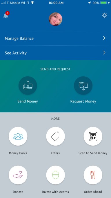
PayPal is revamping its mobile app. Again. In an effort to keep pace with newcomers like the bank-owned Zelle, PayPal says its new app will focus on making it easier to use its core features – that is, sending and requesting money. That means many of the app’s homescreen buttons – like Offers, Donate, Order Ahead and others are being tucked away underneath a new “More” menu to eliminate some of the clutter.
The PayPal homescreen had gotten a little too busy with all the extra features it has been promoting, which aren’t central to the PayPal experience. For example, it threw in a button suggesting “Invest with Acorns,” after taking a stake in the mobile investing app that rounds up purchases and automatically invests the extra change on your behalf. It has been pushing its Order Ahead functionality for years, even though no one thinks to launch a payments app when they’re hungry. Now these buttons no longer get top billing and valuable homescreen space.

Above: PayPal’s app today, before the update
However, even though PayPal is removing a lot of these extras from the homescreen, it’s not actually giving its “Send” and “Request” buttons more room. In fact, they’re getting a little less.
Today, those buttons are in the center of the homescreen, hosted in a big, greenish-blue banner. The updated app relocates them to a bottom bar.
However, it reverts the app’s color scheme to PayPals’ more familiar dark blue-and-white branding, so the relocated buttons are actually easier to see.
The homescreen instead dedicates most of its room to a new personalized notifications section.
Here, users will see alerts about money they’ve received or payment requests from others in big, blue cards you can swipe through horizontally. Below this, is a strip of profile icons and names of those you’ve recently paid – the theory being that PayPal is often used among the same set of family, friends or businesses. This makes it easier to make your next payment to one of your “regulars.”
Beneath this strip, your PayPal balance is displayed, while other notifications and settings are accessed through small buttons at the top of the screen, as before.
The overall design feels more in tune with PayPal’s brand than the last update. Though the prior big revamp, which was over two years ago, modernized things up a bit, it did so with too-light icons, small fonts and odd, off-brand color choices.
PayPal says the new app is rolling out now on Android to select markets, including Australia and Italy. It will then roll out to the U.S. and other markets worldwide, followed by a release on iOS.


0 comments
Post a Comment