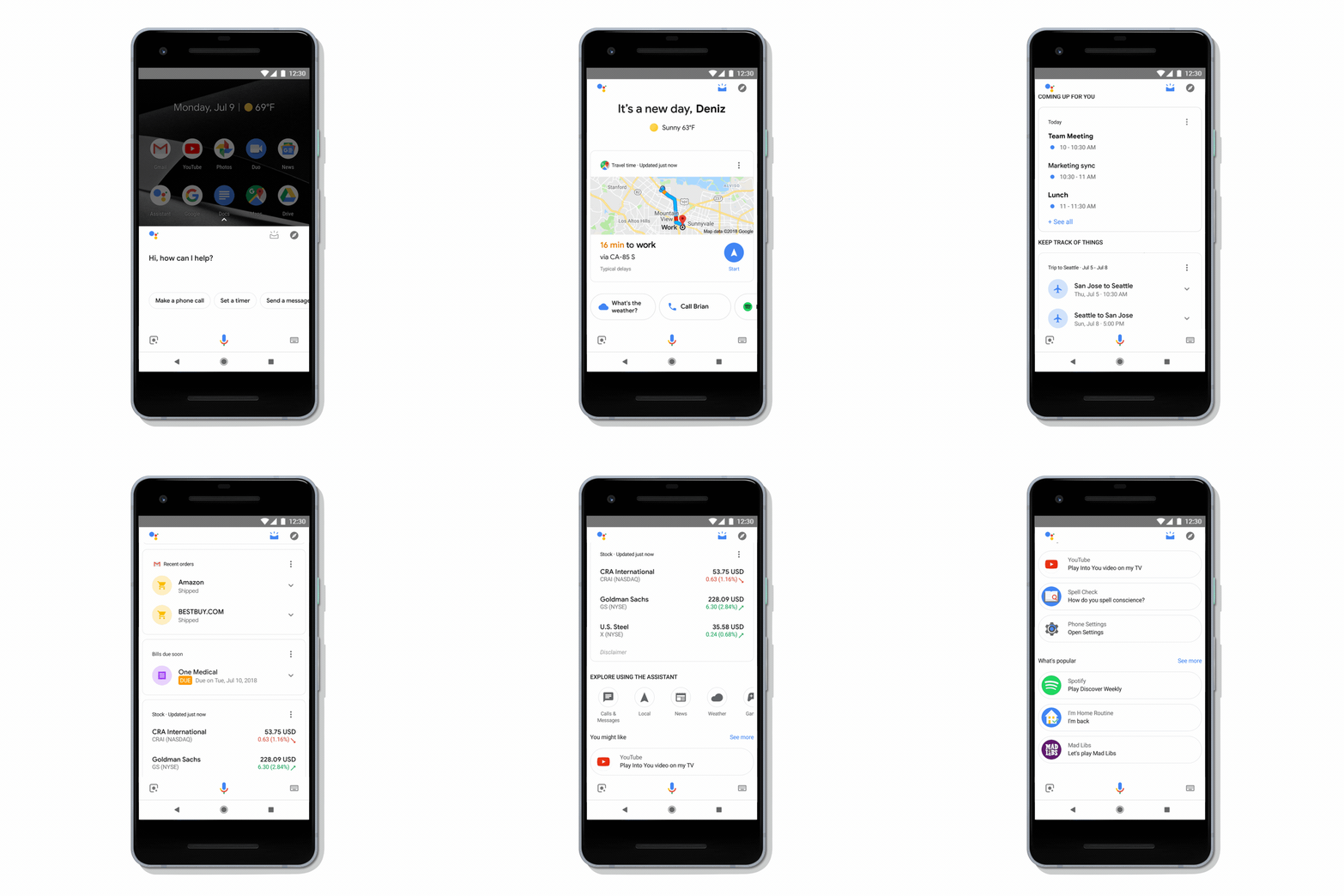
Google today is launching a major visual redesign of its Assistant experience on phones. While the original vision of the Assistant focused mostly on voice, half of all interactions with the Assistant actually include touch. So with this redesign, Google acknowledges that and brings more and larger visuals to the Assistant experience.
If you’ve used one of the recent crop of Assistant-enabled smart displays, then some of what’s new here may look familiar. You now get controls and sliders to manage your smart home devices, for example. Those include sliders to dim your lights and buttons to turn them on or off. There also are controls for managing the volume of your speakers. Even in cases where the Assistant already offered visual feedback — say when you ask for the weather — the team has now also redesigned those results and brought them more in line with what users are already seeing on smart displays from the likes of Lenovo and LG. On the phone, though, that experience still feels a bit more pared down than on those larger displays.
With this redesign, which is going live on both Android and in the iOS app today, Google is also bringing a little bit more of the much-missed Google Now experience back to the phone. While you could already bring up a list of upcoming appointments, commute info, recent orders and other information about your day from the Assistant, that feature was hidden behind a rather odd icon that many users surely ignored. Now, after you’ve long-pressed the home button on your Android phone, you can swipe up to get that same experience. I’m not sure that’s more discoverable than previously, but Google is saving you a tap.
[gallery ids="1725618,1725621,1725611,1725608,1725609,1725614,1725615,1725617,1725616,1725619,1725620,1725624"]In addition to the visual redesign of the Assistant, Google also today announced a number of new features for developers. Unsurprisingly, one part of this announcement focuses on allowing developers to build their own visual Assistant experiences. Google calls these “rich responses” and provides developers with a set of pre-made visual components that they can easily use to extend their Assistant actions. And because nothing is complete with GIFs, they can now use GIFs in their Assistant apps, too.

But in addition to these new options for creating more visual experiences, Google is also making it a bit easier for developers to take their users money.
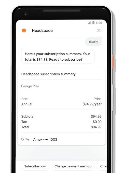
While they could already sell physical goods through their Assistant actions, starting today, they’ll also be able to sell digital goods. Those can be one-time purchases for a new level in a game or recurring subscriptions. Headspace, which has long offered a very basic Assistant experience, now lets you sign up for subscriptions right from the Assistant on your phone, for example.
Selling digital goods directly in the Assistant is one thing, but that sale has to sync across different applications, too, so Google today is also launching a new sign-in service for the Assistant that allows developers to log in and link their accounts.
“In the past, account linking could be a frustrating experience for your users; having to manually type a username and password — or worse, create a new account — breaks the natural conversational flow,” the company explains. “With Google Sign-In, users can now create a new account with just a tap or confirmation through their voice. Most users can even link to their existing accounts with your service using their verified email address.”
Starbucks has already integrated this feature into its Assistant experience to give users access to their rewards account. Adding the new Sign-In for the Assistant has almost doubled its conversion rate.
[gallery ids="1725662,1725659,1725661,1725657,1725658,1725660"]


0 comments
Post a Comment