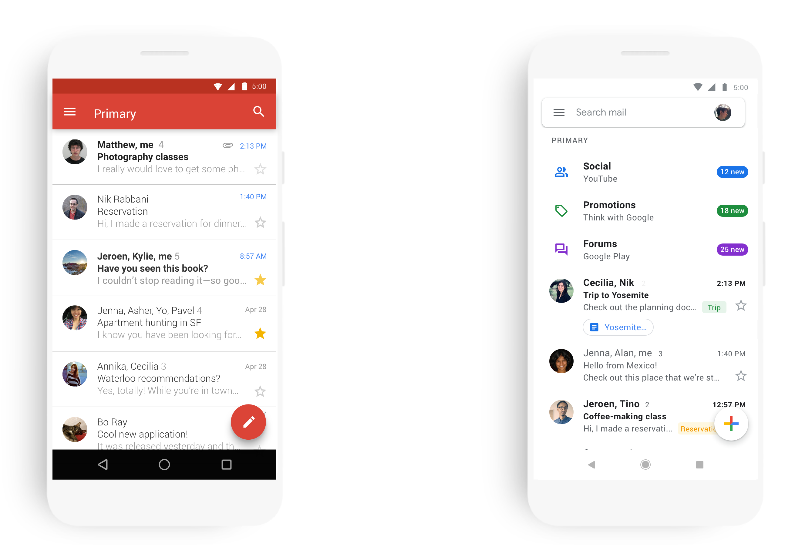
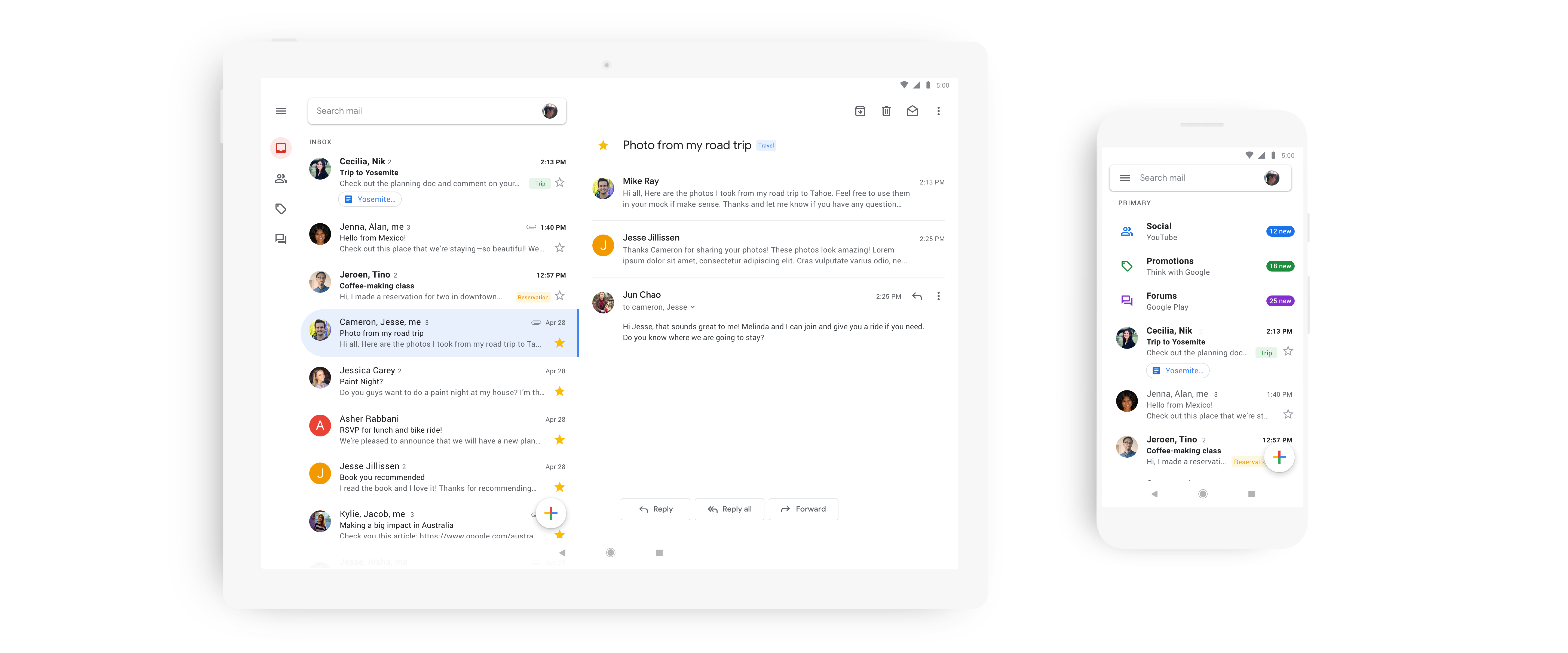
Gmail on mobile will soon get a new look. Google today announced that its mobile email apps for iOS and Android are getting a redesign that is in line with the company’s recent Material Design updates to Gmail, Drive, Calendar and Docs and Site. Indeed, the new UI will look familiar to anybody who has ever used the Gmail web app, including that versions ability to select three different density styles. You’ll also see some new fonts and other visual tweaks. In terms of functionality, the mobile app is also getting a few new features that put it on par with the web version.
Like on the desktop, you can now choose between the default view, as well as a comfortable and compact style. The default view features a generous amount of white space and the same attachment chips underneath the email preview as the web version. The comfortable view does away with those chips and the compact view removes a lot of the space between messages to show you more emails at a glance.

I’ve been testing the new app for a bit and quickly settled on the comfortable view since I never found the attachment chips all that useful in day-to-day use.
 In line with Google’s Material Design guidelines, all the styles feature relatively subtle but welcome animations that don’t take a lot of time but give you a couple of extra visual cues about what’s going on as you work your way to Inbox Zero.
Google also notes that the new design makes it a bit easier to switch between accounts. I’m not sure I agree (I definitely find the implementation of this in Inbox, which is sadly going away soon, easier to use), but if you regularly use this feature, it’s still easy enough to use. The switcher is now part of the search bar, though, which is a bit confusing and took me a moment to find.
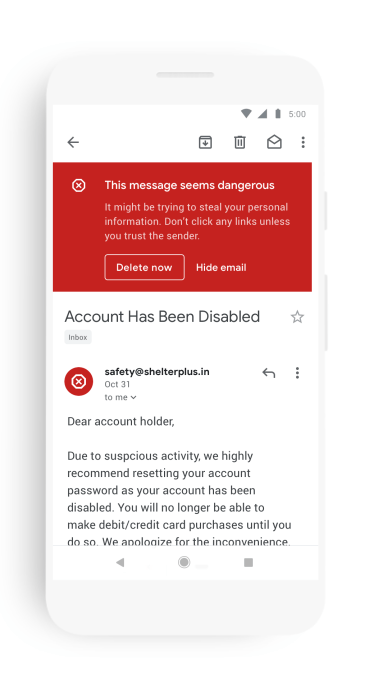
One nice addition to the mobile app is that the large red phishing and scam warning box from the web version now also appears in the mobile app.


0 comments
Post a Comment