Sick of those anxiety-inducing red dots constantly appearing on the Groups, Watch, or other tabs in your Facebook app? Well the social network may be easing up a little in its unending war for your attention. Facebook is now testing a toggle to turn off the red in-app notification dots on its homescreen. Until now you had to manually open each of Facebook’s features to extinguishing the maddening flame of the notification badge. This could make Facebook feel more tranquil, and keep you focused on whatever you actually opened the app to do.
“It’s related to the work we’re doing with the well-being team. We’re thinking about how people spend their time in the app and making sure that it’s time well spent” a Facebook spokesperson tells me. Many people can’t feel settled if there are red dots begging to be tapped — a psychological quirk Facebook takes advantage of. The company seems to be realizing that its growth hacking can backfire if its pleas for engagement actually deter us from opening its app in the first place.
The Facebook Notification Dots setting was first spotted in its prototype form by reverse engineering specialist Jane Manchun Wong, hidden in the Android app’s code earlier this summer. Today, social media consultant Matt Navarra noticed the feature being publicly tested. Facebook now confirms to TechCrunch that this is a new global test that started recently on iOS and Android for a subset of users. “We are testing new ways to give people more control over the notifications they receive in the Facebook app” a spokesperson tells me.
Facebook plans to continue offering additional ways to personalize notifications so you don’t miss what’s important but aren’t drowned in noise. “People don’t necessarily want to see a notification on the badge [the in-app dots on tabs] if they’re already getting notifications in the jewel [the red counter on the Facebook app icon on your phone’s homescreen]” the spokesperson tells me. It considered a snooze option but went with an on/off switch that’s the least confusion. The Notification dots feature is likely to roll out to everyone unless it suddenly proves to decimate Facebook usage.

How To Turn Off Facebook Notification Dots
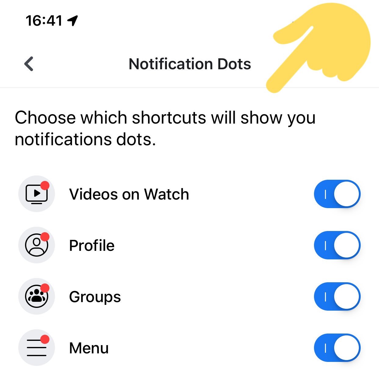
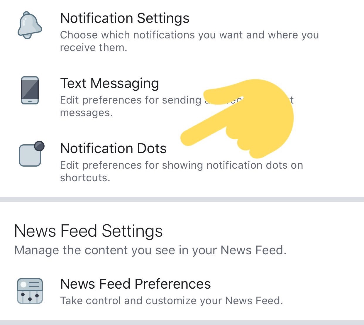
If you have access to this feature test, you’ll find the option in your Facebook app under the three-lined More/Menu tab -> Settings & Privacy -> Settings -> Notifications -> Notification Dots. There you can “Choose which shortcuts will show you notifications dots” with options for “Videos On Watch”, “Profile”, “Groups”, “Menu”.
One tab/shortcut where you can’t disable the dots is Notifications, which actually makes sense since that’s the main way the app alerts you to activity around your profile and content. But since you already get a heads-up about new Groups posts or when you’re tagged in a photo there, the notification dots on the other tabs are just redundant and distracting.

If you want to control which activities trigger alerts in your Notifications tab, you can go to More/Menu tab -> Settings & Privacy -> Settings -> Notifications -> Notification Settings -> Mobile. There you can see a list of your recent notifications and turn off ones like it in case you’re sick of hearing about friends starting fundraisers, reminders about upcoming events, or comments after yours on a Group post. The Notification Settings page also lets you turn off sound for Facebook notifications, axe them from specific groups or other apps, turn down the frequency of On This Day alerts, and choose what notifications get bumped up to email or text message.
Confusingly, there’s also a totally separate menu that’s accessible from the Notifications tab’s settings gear icon. There you can temporarily or permanently mute push notifications and choose where you receive each type. Obviously there should be a link between these two different spaces. A great next step for Facebook would be allowing user to batch notifications, Instead of either being constantly pestered or totally in the dark, it could let users opt for an occasional digest of notifications, like once per day or when they get to 10 alerts.

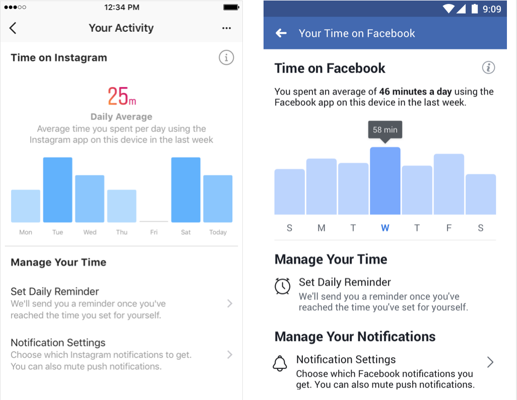
A year ago Facebook trumpeted how it launched a Time Well Spent dashboard in its app and Instagram for showing how long per day you use the apps with an option to set a reminder to stop after enough minutes. But buried inside Menu -> Settings & Privacy -> Your Time on Facebook, the toothless feature we’d previously scooped isn’t doing much good. If Facebook wants to be a principled citizen of our devices, it shouldn’t be so hard to say when we do or don’t want to be nagged for attention.


0 comments
Post a Comment