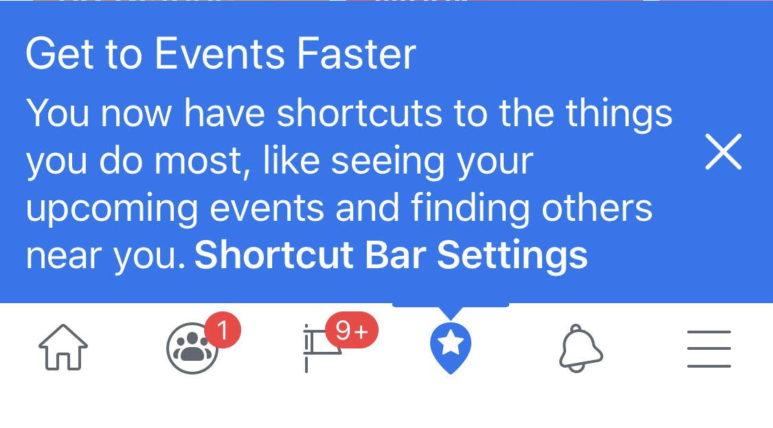
Are those red notification dots on your Facebook home screen driving you crazy? Sick of Facebook Marketplace wasting your screen space? Now you can control what appears in the Facebook app’s navigation bar thanks to a new option called Shortcuts Bar Settings.
Over the weekend TechCrunch spotted the option to remove certain tabs like Marketplace, Watch, Groups, Events, and Dating or just silence their notification dots. In response to our inquiry, Facebook confirms that Shortcut Bar Settings is now rolling out to everyone, with most iOS users already equipped and the rest of Android owners getting it in the next few weeks.

The move could save the sanity and improve the well-being of people who don’t want their Facebook cluttered with distractions. Users already get important alerts that they could actually control via their Notifications tab. Constant red notification counts on the homescreen are an insidious growth hack, trying to pull in people’s attention to random Group feeds, Event wall posts, and Marketplace.
“We are rolling out navigation bar controls to make it easier for people to connect with the things they like and control the notifications they get within the Facebook app” a Facebook spokesperson tells me.
Back in July 2018, Facebook said it would start personalizing the navigation bar based on what utilities you use most. But the navigation bar seemed more intent on promoting features Facebook wanted to be popular like its Craigslist competitor Marketplace, which I rarely use, rather than its long-standing Events feature I access daily.

To use the Shortcuts Bar Settings options, tap and hold on any of the shortcuts in your navigation bar that’s at the bottom of the Facebook homescreen on iOS and the top on Android. You’ll see a menu pop up letting you remove that tab entirely, or leave it but disable the red notification count overlays. That clears space in your nav bar for a more peaceful experience.
You’ll also now find in the three-line More tab -> Settings & Privacy -> Settings -> Shortcuts menu the ability to toggle any of the Marketplace, Groups, Events, and Pages tabs on or off. Eagle-eyed reverse engineering specialist Jane Manchun Wong spotted in June that Facebook was testing Notification Dots settings menu that’s now available too.
A Facebook spokesperson admits people should have the ability to take a break from notifications within the app. They tell me Facebook wanted to give users more control so they can have access to what’s relevant to them.
For all of Facebook’s talk about well-being, with it trying out hiding Like counts in its app and Instagram (this week starting in the US), there’s still plenty of low-hanging fruit. Better batching of Facebook notifications would be a great step, allowing users to get a daily digest of Groups or Events posts rather than a constant flurry. Its Time Well Spent dashboard that counts your minutes on Facebook should also say how many notifications you get of each type, how many you actually open, and let you disable the most common but useless ones right from there.
If Facebook wants to survive long-term, it can’t piss off users by trapping them in an anxiety-inducing hellscape of growth hacks that benefit the company. The app has become bloated and cramped with extra features over the last 15 years. Facebook could get away with more aggressive cross-promotion of some of these forgotten features as long as it empowers us to hide what we hate.
from Social – TechCrunch https://ift.tt/2qDtPgR Facebook finally lets you banish nav bar tabs & red dots Josh Constine https://ift.tt/2K7SVLG
via IFTTT


0 comments
Post a Comment