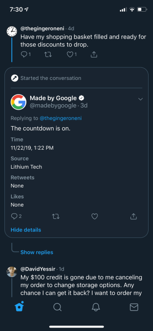
Twttr, the prototype app Twitter launched earlier this year, has been testing new ways to display conversations, including through the use of threaded replies and other visual cues. Now, those features have been spotted on Twitter.com, giving the service a message board-like feel where replies are connected to original tweeter and others in a thread by way of thin, gray lines.
As you may recall, the goal with twttr was to give Twitter a place outside of its main app to publicly experiment with more radical changes to the Twitter user interface, gain feedback, then iterate as needed, before the changes were rolled out to Twitter’s main user base. Since its arrival in March, the prototype twttr app has focused mainly on how threaded conversations would work, sometimes including different ways of labeling the posters in a thread, as well.
Currently, for example, twttr labels the original poster — meaning the person who started a conversation — with a little microphone icon, similar to Reddit. It’s also testing a way to view the tweet details in a card-style layout you can activate with a tap.

But its main focus continues to be on the display of the threads themselves.
Following its launch, the work on twttr slowed as did the excitement over its exclusive, invite-only Twitter experience. Instead of being a continual testbed of new ideas, twttr mostly rolled out small tweaks to threads. And it never branched out beyond conversation redesigns to test entirely new features, like Twitter’s recently launched Topics, for example.
In August, Sara Haider, who had been heading up the design of Conversations on Twitter — a role that included running twttr — announced she would be moving to a new team at the company. Meanwhile, Suzanne Xie, who had just joined Twitter by way of the Lightwell acquisition, stepped in to lead Conversations instead. She confirmed at the time that part of her role would be working with the twttr team to bring its best parts to the main Twitter app.
That work now appears to be underway.
Noted reverse engineer Jane Manchun Wong spotted a conversation tree layout being developed on Twitter.com, identical to the one found on twttr.
And just this week, the feature was tweaked a bit more to include the ability to focus on a specific tweet, even from a permalink — also similar to twttr’s card-style layout, which highlights tweets you tap within a thread in the same way.
Wong wasn’t opted into an A/B test on Twitter.com to view this feature but rather found it through her investigative techniques, we understand.
Twitter confirmed what she found is part of the company’s broader plan to bring twttr’s features to Twitter — a rollout that will take place next year, a spokesperson said.
In addition, the company is considering how to use the twttr app to experiment with other features going forward, it says.
from Social – TechCrunch https://ift.tt/34myZwJ Twitter tests new conversation features from twttr prototype, rollout planned for 2020 Sarah Perez https://ift.tt/2OJhmjW
via IFTTT


0 comments
Post a Comment