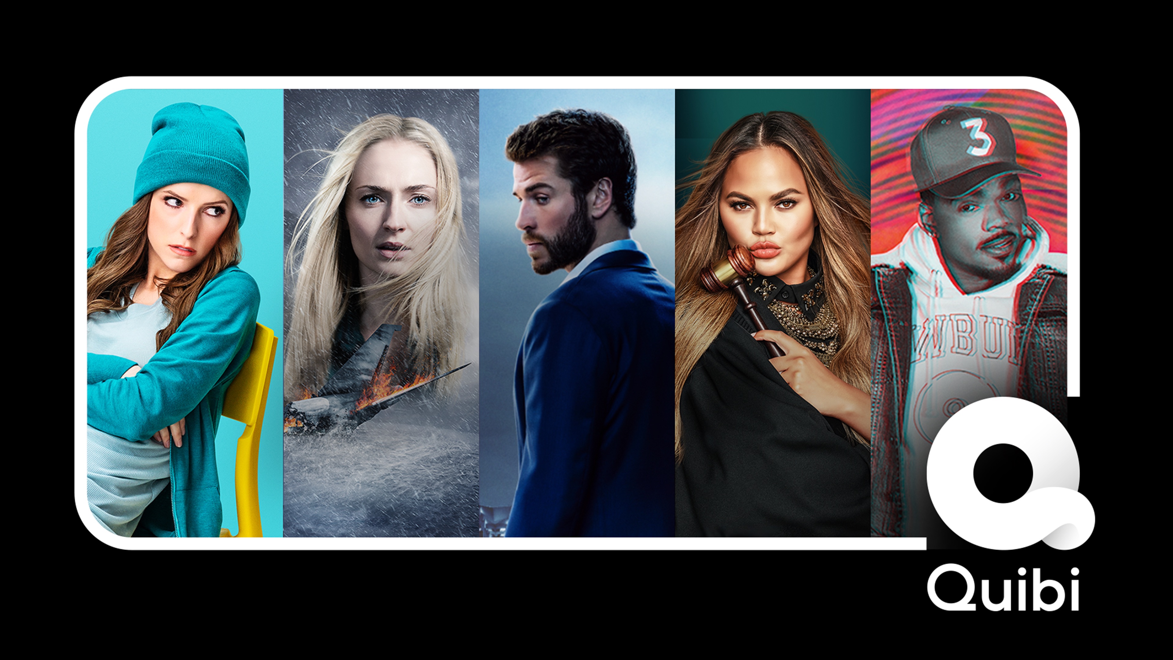
It takes either audacious self-confidence or reckless hubris to build a completely asocial video app in 2020. You can decide which best describes Quibi, Hollywood’s $1.75 billion-funded attempt at a mobile-only Netflix of 6 to 10 minutes micro-TV show episodes. Quibi manages to miss every trend and tactic that could help make it app popular. The company seems to believe it can succeed on only its content (mediocre) and marketing dollars (fewer than it needs).
I appreciate that Quibi is doing something audaciously different than most startups. Rather than iterating towards product-market fit, it spent a fortune developing its slick app and buying fancy content in secret so it could launch with a bang.
Yet Quibi’s bold business strategy is muted by a misguided allegiance to the golden age of television before the Internet permeated every entertainment medium. It’s unshareable, prescriptive, sluggish, cumbersome, and unfriendly. Quibi’s unwillingness to borrow anything from social networks makes the app feel cold and isolated, like watching reality shows in the vacuum of space.
In that sense, Quibi is the inverse of TikTok, which feels fiercely alive. TikTok is designed to immediately immerse you in crowd-vetted content that grabs your attention and inspires you to spread your take on it to friends. That’s why TikTok has almost 2 billion downloads to date while Quibi picked up just 300,000 on the day of its big splash into market.
Here’s a breakdown of the major missteps by Quibi, why TikTok does it better, and how this new streaming app can get with the times.
What Hollywood Thinks We Want
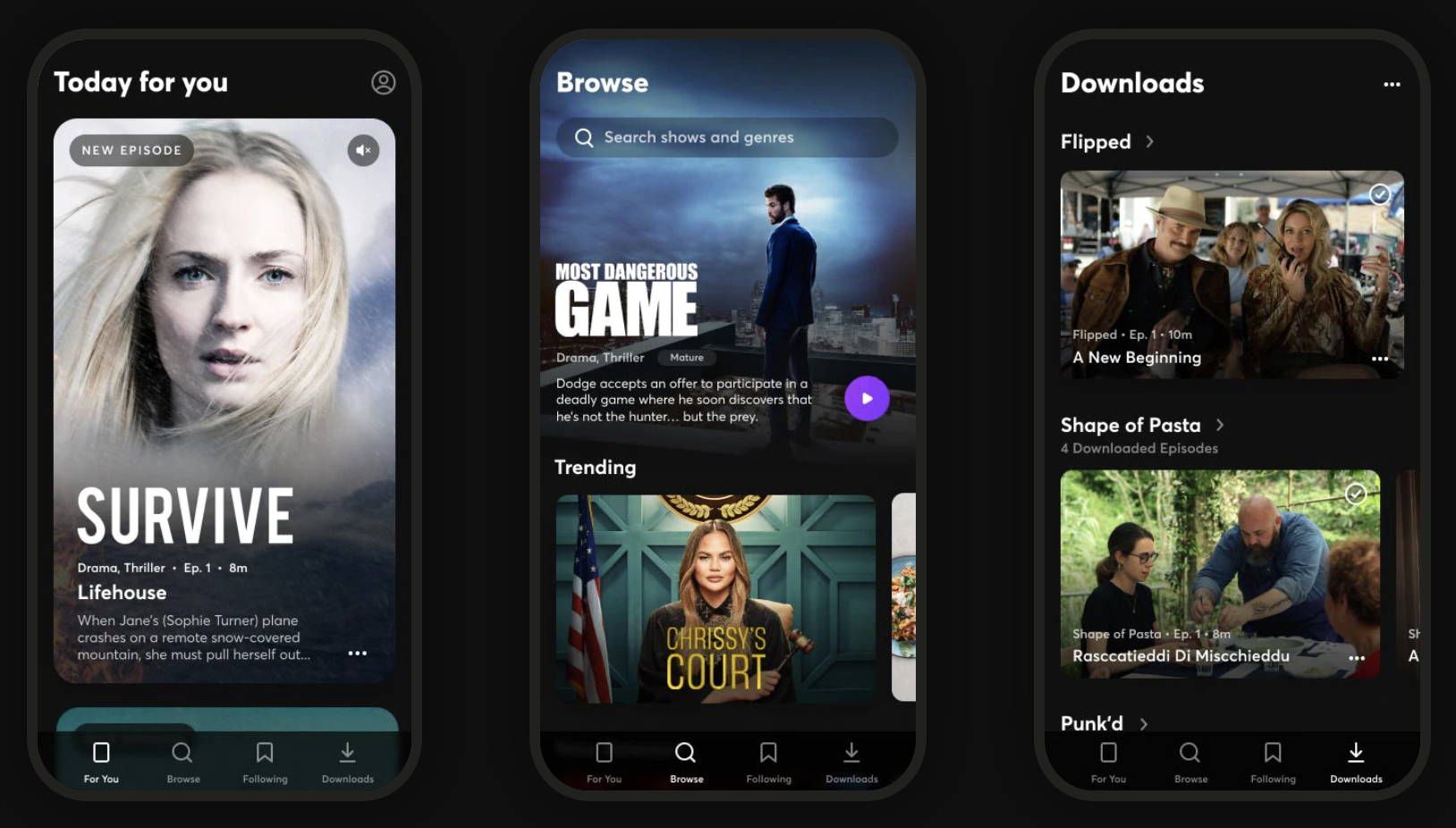
Quibi feels like some off-brand cable channel, with a mix of convoluted reality shows, scripted dramas, and news briefs. Imagine MTV at noon in the mid-2000s. Nothing seemed must-see. There’s no Game Of Thrones or Mandalorian here. While the production value is better than what you’ll find on YouTube, the show concepts feel slapdash with novelty that quickly fades. Chrissy Teigen as a small claims court judge and a cooking show where blindfolded chefs have to guess what food was just exploded in their faces…
The catalog feels like the product of TV writers being told they have 10 seconds to come up with an idea. “What would those idiots watch?” The shows remind me of old VR games that are barely more than demos, or an app built in a garage without ever asking prospective users what they need. Co-founder Jeffrey Katzenberg may have produced The Lion King and Shrek, but the app’s content feels like it was greenlit by, well, Hewlett Packard Enterprise’s leader Meg Whitman who indeed is Quibi CEO.
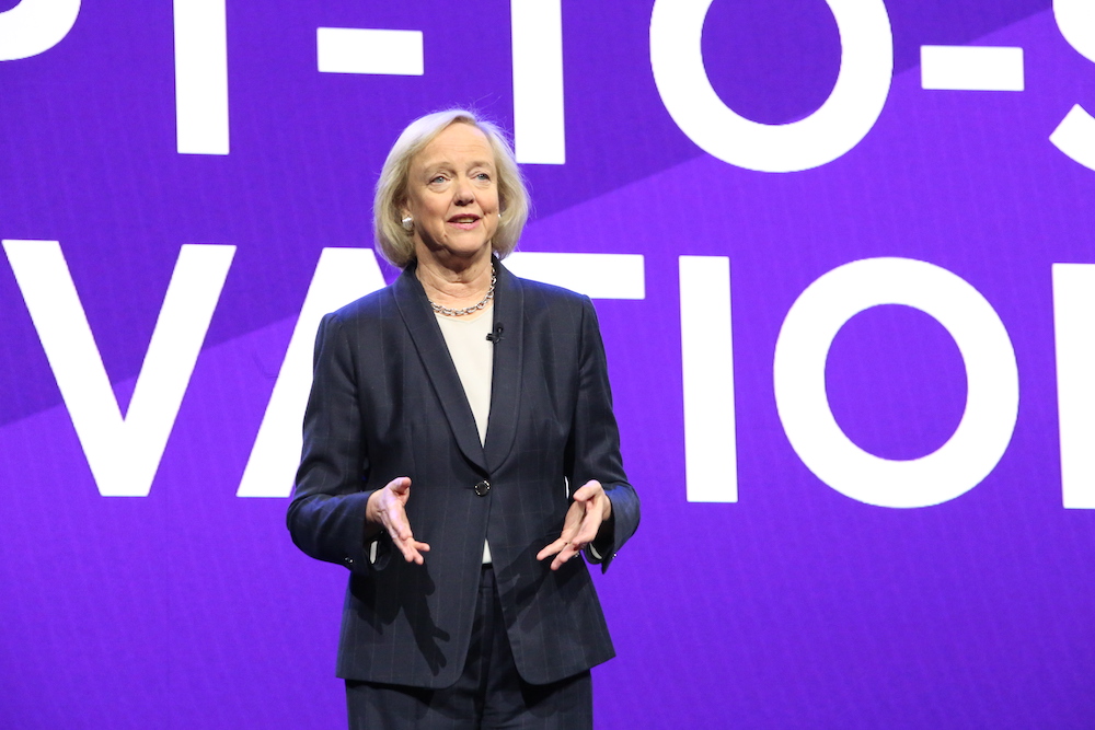
Quibi CEO Meg Whitman
Despite being built for a touch-screen interface, there’s little Bandersnatch-style interactive content so far, nor are the creators doing anything special with the 6 to 10 minute format. The shows feel more like condensed TV programs with episodes ending when there would be a commercial break. There’s no onboarding process that could ask what popular TV shows or genres you’re into. As the catalog expands, that makes it less likely you’ll find something appealing within a few taps.
TikTok comes from the opposite direction. Instead of what Hollywood thinks we want, its content come straight from its consumers. People record what they think would make them and their friends laugh, surprised, or enticed. The result is that with low to zero production budget, random kids and influencers alike make things with millions of Likes. And as elder millenials, Gen X, and beyond get hooked, they’re creating videos for their peers as well. The algorithm monitors what you’re hovering over and rapidly adapts its recommendations to your style.
TikTok is fundamentally interactive. Each clip’s audio can borrowed to produce remixes that personalize a meme for a different demographic or subculture. And since its stars are internet natives, they’re in constant communication with their fan base to tune content to what they want. There’s something for everyone. No niche is too small.
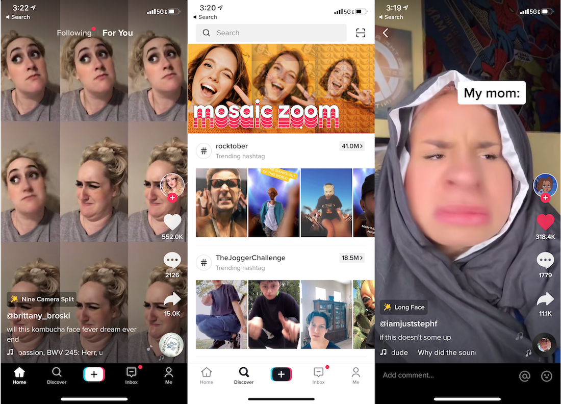
TikTok Screenshots
The Fix: Quibi should take a hint from Brat TV, the Disney Channel for the YouTube generation that gives tween social media stars their own premium shows about being a grade school kid to create content with a built-in fan base. [Disclosure: My cousin Darren Lachtman is a Brat co-founder).
Take the Chrissy’s Court model, and shift it to stars who are 20 years younger. Give TikTok phenoms like Charli D’Amelio or Chase Hudson Quibi shows and let them help conceptualize the content, and they’ll bring their legions of fans. Double-down on choose-your-own-adventures and fan voting gameshows that leverage the phone’s interactivity. Fund creators that will differentiate Quibi by making it look like anything other than daytime TV. And ask users directly what they want to see right when they download the app.
No Screenshots
This is frankly insane. Screenshots of Quibi appear as a blank black screen. That means no memes. If people can’t turn Quibi scenes into jokes they’ll share elsewhere, its shows won’t ever become fixtures of the cultural zeitgeist like Netflix’s Tiger King has. Yes, other mobile streaming apps like Netflix and Disney+ also block screenshots, but they have web versions where you can snap and share what you want. Quibi never should have structured its deals to license content from producers in a way that prevented any way to riff on or even let friends preview its content.
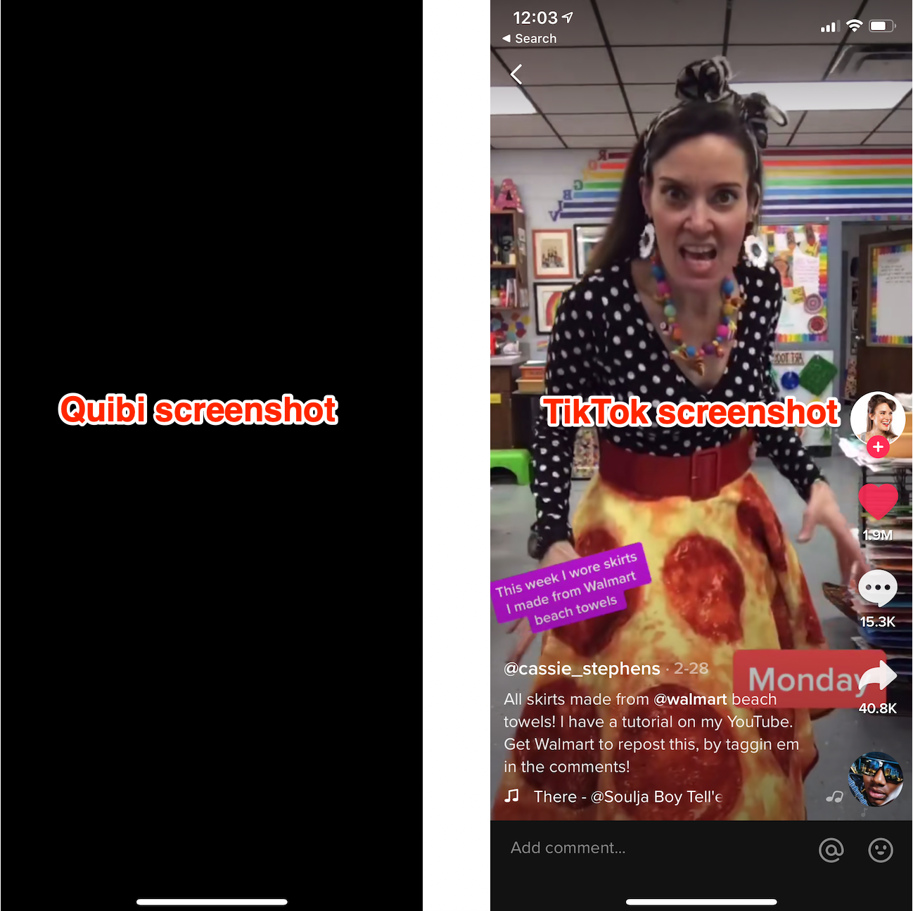
TikTok on the other hand defaults to letting you download any video and share it wherever you please — with the app’s watermark attached. That’s fueled TikTok’s stellar growth as clips get posted to Twitter and Instagram, and drive viewers back to the app. It’s spawned TikTok compilations on YouTube, and a whole culture of remixing that expands and prolongs the popularity of trending jokes and dances.
The Fix: Quibi should allow screenshots. There’s little risk of spoilers or piracy. If its deals prohibit that, then it should offer pre-approved screenshots and video clips/trailers of each episode that you can download and share. Think of it like an in-app press kit. Even if we’re not allowed to set up the perfect screenshot for making a meme, at least then we could coherently discuss the shows on other social networks.
Sluggish Pacing
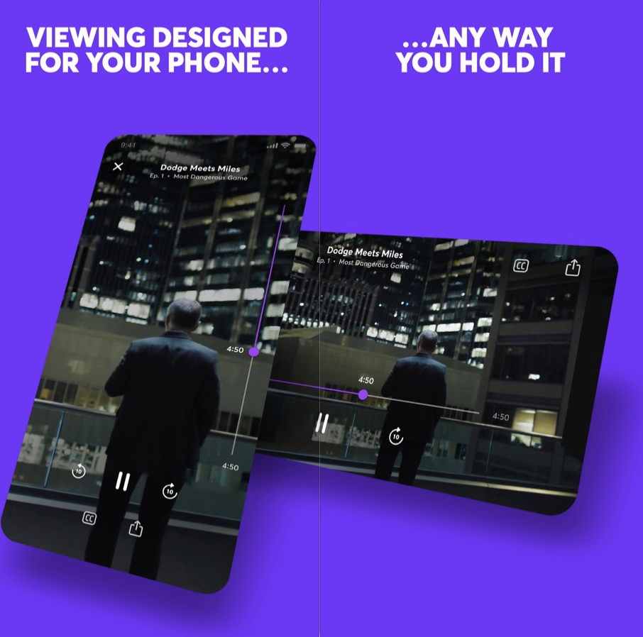
On mobile, you’re always just a swipe away from something more interesting. It’s like if you watched TV with your finger permanently hovering over the change channel button. Ever noticed how movie trailers now often start with a fast-forward collage of their most eye-catching scenes? Quibi seems intent on communicating prestige with its slow-building dramas like The Most Dangerous Game and Survive, which both had me bored and fast-forwarding. And that’s watching Quibi at home on the couch. While on the go where it was designed to be consumed, slow pacing could push users with a minute or two to spare to open Instagram or TikTok instead.
None of this is helped by Quibi not auto-playing a trailer or the first episode the moment you scroll past a show on the homescreen. Instead, you see a static title card for two seconds before it starts playing you an excerpt of the program. That makes it more cumbersome to discover new shows.
Where TikTok wins is in immediacy. Creators know users will swipe right past their video if it’s not immediately entertaining or obviously revving up to a big reveal. They grab you in the first second with smiles, costumes, bold captions, or crazy situations. That also makes it easy for viewers to dismiss what’s irrelevant to them and teach the TikTok algorithm what they really want. Plus, you know that you can score a dopamine hit of joy even if you only have 30 seconds. TikTok makes Quick Bites feel like an understaffed sit-down restaurant.
The Fix: Quibi needs to teach creators to hook viewers instantly by previewing why they should want to watch. Since tapping a show’s card on the Quibi homepage instantly plays it, those teasers need to be built into the first episode. Otherwise, Quibi needs to a button to view a trailer from its buried dedicated show pages to the preview card most people interact with on the homescreen. Otherwise, users may never discover what Quibi shows resonate with them and teach it what to show and make more of.
Anti-Social Video Club
Quibi neglects all its second-screen potential. No screenshotting makes it tough to discuss shows elsewhere, yet there’s no built-in comments or messaging to discuss or spread them in app. Pasting an episode link into Twitter doesn’t even display the show’s name in the preview box. Nor do shows have their own social accounts to follow to remind you to keep watching.
There’s no way for friends to follow what you’re watching or see your recommendations. No leaderboards of top shows. Certainly no time-stamped, livestream style crowd annotations. No synced-up co-watching with friends, despite a lack of TV apps preventing you from watching with anyone else in person unless you crowd around one phone.
It all feels like Quibi figured advertising would be enough. It could run contests where winners get a Cameo-esque message or chat with their favorite stars. Quibi could let you share scenes with your face swapped onto actors’ heads, Deepfake-style like Snapchat’s (confusingly named) Cameos feature. It could host in-app roundtables with the casts where users could submit questions. It’s like if web 2.0 never happened.
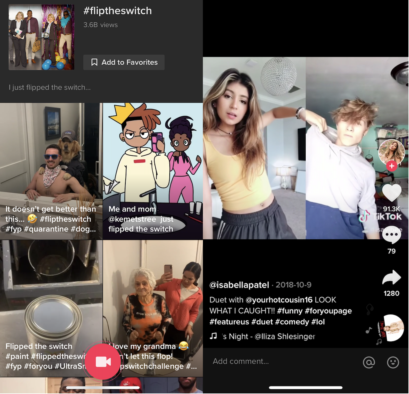
TikTok meanwhile harnesses every conceivable social feature. Follow, Like, comment, message, go Live, duet, remix, or download and share any video. It beckons viewers to participate in trending challenges. And even when users aren’t itching to return to TikTok, notifications from these social features will drag them back in, or watermarked clips will follow them to other networks. Every part of the app is designed to make its content the center of popular culture.
The Fix: Quibi needs to understand that just because we’re watching on mobile, doesn’t make video a solo experience. At first, it should add social content discovery options so you can see what friends opt in to share that they’re watching or view a leaderboard of the top programs. Shows, especially ones dripping out new episodes, are more fun when you have someone to chat about them with.
Eventually, Quibi should layer on in-app second screen features. Create a way to share comments at the end of each episode that people read during the credits so they feel like they’re in a viewing community.
Can Quibi Be More?
What’s most disappointing about Quibi is that it has the potential to be something fresh, merging classically produced premium content with the modern ways we use our phones. Yet beyond shows being shot in two widths so you can switch between watching in landscape or portrait mode at any time, it really is just a random cable channel shrunk down.
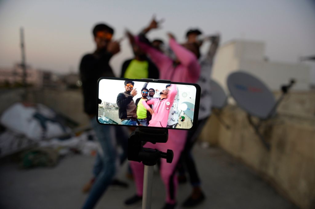
Youths act in front of a mobile phone camera while making a TikTok video on the terrace of their residence in Hyderabad on February 14, 2020. (Photo by NOAH SEELAM / AFP) (Photo by NOAH SEELAM/AFP via Getty Images)
One of the few redeeming opportunities for Quibi is using the daily episode release schedule to serialize content that benefits from suspense, as InternetRyan notes. Binging via traditional streaming services can burn through thrillers before they can properly build up suspense and fan theories or let late-comers catch up while a show is still in the zeitgeist. Cliffhangers with just a day instead of a week to wait could be Quibi’s killer feature.
Suspense is also one thing TikTok fails at. Within a single video, they’re actually often all about suspense, waiting through build up for a gag or non-sequitur to play out. But creators try to rope in followers by making a multi-minute video and splitting it into parts so people subscribe to them to see the next part. Yet since TikTok doesn’t always show timestamps and surfaces old videos on its homescreen, it can often be a chore to find the part two, and there’s no good way for creators to link them together. TikTok could stand to learn about multi-episode content from Quibi.
But today, Quibi feels like a minitiaturized and degraded version of what we already get for free on the web or pay for with Netflix. Quibi charging $4.99 per month with ads or $7.99 without seems like a steep ask without delivering any truly must-see shows, novel interactive experience, or memory-making social moments.
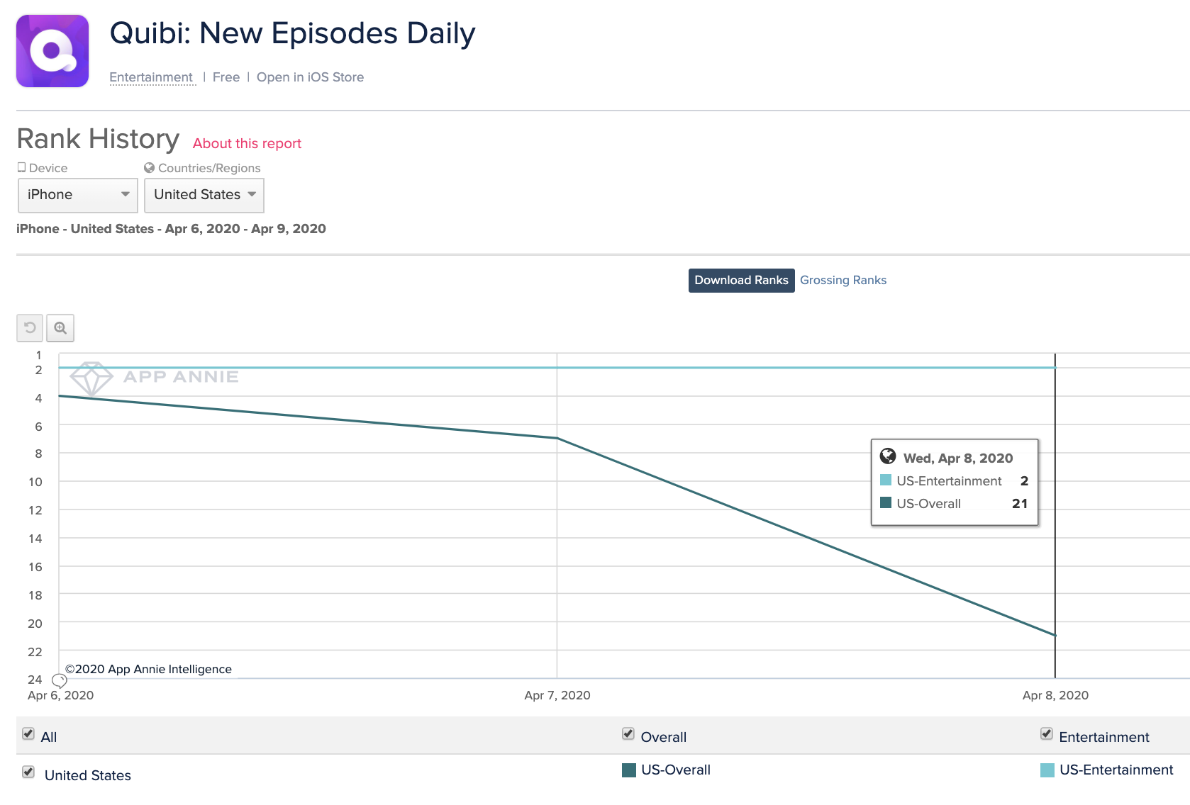
Quibi’s success may simply be a test of how bad people are at cancelling 90-day free trials (hint: they’re bad at it!). The bull case is that absent-minded subscribers amongst the 300,000 first-day downloads and some diehard fans of the celebs it’s given shows will bring Quibi enough traction to raise more cash and survive long enough to socialize its product and teach creators to exploit the format’s opportunities. But the bear case is already emerging in Quibi’s rapidly declining App Store rank, that fell from #4 overall when it launched Monday to #21 yesterday. Lackluster content and no virality means it might never become the talk of the town, leading top content producers to slink away or half-ass their contributions, leaving us to dine on short video elsewhere.
https://ift.tt/34sTY1F Quibi is the anti-TikTok (that’s a bad thing) https://ift.tt/2yIK9kl


0 comments
Post a Comment